In
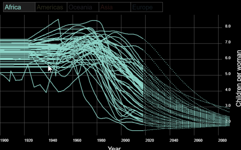
this short video, Professor Hans Rosling describes how fertility rates have dropped over time (from 6 children per women in 1800 to 2.5 children per women now). We can use Processing to recreate the chart that Professor Rosling showed. In our version of the chart, we rendered each country’s total fertility rate (TFR) separately and grouped the countries by region.
Click to cycle through different regions in the chart below:
[raw]
[/raw]
Some interesting conclusions can be made from this version of the chart:
- Europe started with a lower TFR than other regions.
- In addition, European countries have less variability in TFR values, especially recently.
- TFR in the Americas and Asia began to decline in the 1960s.
- In contrast, the TFR in Africa began to drop in the 2000s.
The data files used to create this chart are available for you to play with in
KTBYTE Coder. The TFR data file looks like this:
Country,1900,1901,1902,1903,1904,1905,...
Afghanistan,7.0013,7.0013,7.0013,7.0013,7.0013,7.0013,...
Austria,4.3372555,4.3457913,4.127855,4.1679015,3.9877143,4.0075936,...
...
Vietnam,4.658,4.616,4.574,4.532,4.49,4.448,...
You can access the lines of this file with the following Processing code:
String lines[] = loadStrings("https://www.ktbyte.com/blog/tfr_visualization/data/tfr_by_year.csv");

// Each line contains the TFR data for a country. Loop over all the countries:
for (int i = 1; i < lines.length; i++) {
    String[] data = line.split(",");
    String countryName = data[0];

    // Loop over each TFR data point for the current country:
    for (int j = 1; j < data.length; j++) {
        float tfr = float(data[i]);
        // Do something with the tfr value...
    }
}
We’ve made a second data file available that contains information about countries, which looks like this:
name,alpha-2,alpha-3,country-code,iso_3166-2,region,sub-region,region-code,sub-region-code
Afghanistan,AF,AFG,004,ISO 3166-2:AF,Asia,Southern Asia,142,034
...
You can access that file like so:
String countryLines[] = loadStrings("https://www.ktbyte.com/blog/tfr_visualization/data/countries.csv");
Data used:
Here is the code for the above visualization:
// This sketch visualizes children per woman (called total fertility rate or TFR)
// over time segmented by country. Countries are grouped into their containing
// geographic region so regional patterns of TFR can be identified.
//
// Total fertility rate data is from Gapminder.org:
// https://www.gapminder.org/data/documentation/gd008/
//
// Country region data is from ISO-3166 standard:
// https://github.com/lukes/ISO-3166-Countries-with-Regional-Codes/blob/master/all/all.csv


// The min and max total fertility rate values
float minTfr = 0;
float maxTfr = 10;

// The min and max years for which there is data
int minYear = 1900;
int maxYear = 2099;

// The cutoff between collected data and extrapolated data
int currentYear = 2018;

// Spacing of region names
int regionNameSpacing = 100;
int regionNameLeftPadding = 20;

// The currently rendered region. Ignored if showAllRegions is true
int currentRegion = 0;

// Whether or not all regions are displayed at once
boolean showAllRegions = false;

// Keeps track of the currently rendered year for animation purposes
int currentDrawYear = 0;

// How may years of data are drawn per frame
int drawStep = 10;

// A list of all world regions
List regions = new ArrayList();

// A map from region name to region object
Map<String, Region> indexedRegions = new HashMap<String, Region>();

// A map from country name to country object
Map<String, Country> countries = new HashMap<String, Country>();

void setup() {
  size(756, 500);
  background(0);
  stroke(0);

  addRegion("Africa", color(141,211,199));
  addRegion("Americas", color(255,255,179));
  addRegion("Oceania", color(190,186,218));
  addRegion("Asia", color(251,128,114));
  addRegion("Europe", color(128,177,211));

  String countryLines[] = loadStrings("https://www.ktbyte.com/blog/tfr_visualization/data/countries.csv");

  // Parse country file and create countries
  for (int i = 1; i < countryLines.length; i++) { String[] split = countryLines[i].split(","); if (split.length >= 6) {
      String countryName = split[0];
      String regionName = split[5];
      addCountry(countryName, regionName);
    }
  }

  String lines[] = loadStrings("https://www.ktbyte.com/blog/tfr_visualization/data/tfr_by_year.csv");

  // Parse TFR data file and add TFR data arrays to country objects
  for (int i = 1; i < lines.length; i++) {
    String line = lines[i];

    String[] data = line.split(",");
    String countryName = data[0];

    float[] parsedData = new float[data.length - 2];
    for (int j = 2; j < data.length; j++) {
      if (data[j] != null && !data[j].equals("null")) {
        parsedData[j - 2] = Float.parseFloat(data[j]);
      }
    }

    if (countries.containsKey(countryName)) {
      countries.get(countryName).setData(parsedData);
    }
  }

  drawChart();
}

// Takes a region name and a color and adds a Region object to
// the region data structures
void addRegion(String regionName, int regionColor) {
  Region region = new Region(regionName, regionColor);
  regions.add(region);
  indexedRegions.put(regionName, region);
}

// Takes a country name and a region name and adds a Country object
// to the country data structure. Also adds the country object to
// the containing region's list of countries.
void addCountry(String countryName, String regionName) {
  if (indexedRegions.containsKey(regionName)) {
    Country country = new Country(countryName);
    countries.put(countryName, country);
    indexedRegions.get(regionName).addCountry(country);
  }
}

// Render data for the passed region
void drawRegion(Region region) {
  stroke(region.regionColor);
  fill(region.regionColor);
  for (Country country : region.countries) {
    if (country.hasData()) {
      // Render data starting from the currentDrawYear
      for (int year = currentDrawYear; year < currentDrawYear + drawStep; year++) {
        float tfr = country.data[year - 1900];
        float nextTfr = country.data[year - 1900 + 1];

        if (year < currentYear) {
          line(
              map(year, minYear, maxYear, 0, width),
              map(tfr, minTfr, maxTfr, height, 0),
              map(year + 1, minYear, maxYear, 0, width),
              map(nextTfr, minTfr, maxTfr, height, 0));
        } else {
          point(
              map(year, minYear, maxYear, 0, width),
              map(tfr, minTfr, maxTfr, height, 0));
        }
      }
    }
  }
}

void draw() {
  strokeWeight(2);

  // If not all the data has been drawn yet, continue to draw it
  if (currentDrawYear < maxYear - drawStep - 1) {
    if (showAllRegions) {
      for (Region region : regions) {
        drawRegion(region);
      }
    } else {
      drawRegion(regions.get(currentRegion));
    }

    // Increment the animation
    currentDrawYear += drawStep;
  }
}

// Restarts the data animation
void drawChart() {
  currentDrawYear = minYear;

  background(0);

  stroke(100);
  strokeWeight(1);

  // Draw grid lines
  for (float tfr = minTfr; tfr < maxTfr; tfr += 1) {
    float y = map(tfr, minTfr, maxTfr, height, 0);
    line(0, y, width, y);
  }

  for (int year = minYear; year < maxYear; year += 20) {
    float x = map(year, minYear, maxYear, 0, width);
    line(x, 0, x, height);
  }

  strokeWeight(1);

  noStroke();
  fill(0);
  rect(width - 60, 0, width, height);

  fill(255);
  textSize(12);

  // Draw TFR labels
  for (float tfr = minTfr; tfr < maxTfr; tfr += 1) {
    float y = map(tfr, minTfr, maxTfr, height, 0);
    text(nfc(tfr, 0), width - 50, y);
  }

  pushMatrix();
  translate(width - 1, height / 2 + 100);
  rotate(-PI / 2);
  textSize(20);
  text("Children per woman", 0, 0);
  popMatrix();

  fill(0);
  rect(0, height - 60, width, height);

  fill(255);
  textSize(12);

  // Draw year labels
  for (int year = minYear; year < maxYear; year += 20) {
    float x = map(year, minYear, maxYear, 0, width);
    text(year, x, height - 40);
  }

  textSize(20);
  text("Year", width / 2 - 40, height - 10);

  fill(0);
  rect(0, 0, width, 60);

  // Draw region buttons at the top of the canvas
  for (int i = 0; i < regions.size(); i++) {
    Region region = regions.get(i);
    textSize(20);

    stroke(100);
    if (currentRegion == i || showAllRegions) {
      fill(30);
    } else {
      fill(0);
    }

    rect(i * regionNameSpacing + regionNameLeftPadding / 2, 20, regionNameSpacing, 30);

    if (currentRegion == i || showAllRegions) {
      fill(region.regionColor);
    } else {
      fill(lerpColor(region.regionColor, color(0), 0.8));
    }

    text(region.name, i * regionNameSpacing + regionNameLeftPadding - 5, 43);
  }
}

void mousePressed() {
  showAllRegions = false;
  if (currentRegion == regions.size()-1) {
    showAllRegions = true;
    currentRegion = -1;
  } else {
    currentRegion = (currentRegion + 1) % regions.size();
  }
  drawChart();
}

// Represents a country and that country's TFR data array
class Country {
  String name;
  float[] data;

  public Country(String name) {
    this.name = name;
  }

  void setData(float[] data) {
    this.data = data;
  }

  boolean hasData() {
    return this.data != null;
  }
}

// Represents a region. A Region stores all of the Country objects
// that are within the region geographically.
class Region {
  String name;
  int regionColor;
  List countries;

  Region(String name, int regionColor) {
    this.name = name;
    this.regionColor = regionColor;
    this.countries = new ArrayList();
  }

  void addCountry(Country country) {
    countries.add(country);
  }
}